Your Logo Is Your Brand’s First Impression
YOUNGSTOWN, Ohio — It doesn’t take much to convey that the shoe with a swoosh on its side is for basketball or that restaurant with the golden arches sells cheeseburgers. Companies such as Nike and McDonald’s have spent billions creating and reinforcing brands that conveys who they are and what they do.
While smaller companies lack the marketing budgets of Nike and McDonald’s – Nike spent $804 million alone on “demand creation” in the third quarter of its fiscal 2016 – an effective logo can create powerful recognition.
“You have one chance to say, ‘This is what we do,’ and your logo is what says it,” says Rob Palowitz, owner of Palo Creative, Boardman. “It’s your first line of interaction. The old adage of there’s only chance to make a first impression is true.”
There are plenty of ways to make a logo recognizable, he continues. It can tell a story or it can relay information about the business. It can be something abstract or it can be literal. Even the colors used can make a brand instantly recognizable. Think Huntington Bank’s bright green.
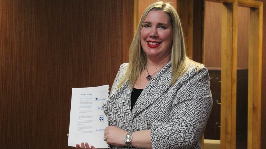
Last October, Cortland Bank introduced a new logo and wordmark that features shades of blues and an abstract wave. It was chosen in part, says its director of marketing and communications, Melissa Maki, because of Mosquito Lake, one of the city of Cortland’s top attractions. And as the bank expands through northeastern Ohio, Lake Erie is a prominent feature in the region, making the logo relevant at all branches.
“It was a combination of that and the financial industry as a whole. I did some research and saw all the logos color-coded,” she says, noting that many banks use various shades of blue. “And blue tends to be a calming, trusting color.”
Palowitz adds that dark colors tend to evoke a more formal, elegant feel in consumers where bright colors trigger images of movement and activity.
There’s also the message that a logo sends about the company. In the course of her three years at Micro Doctor, its marketing manager, Megan Augustine, noticed that many people she met at expos and networking events were confused about the IT support her company offered. Most common, she says, was the assumption that the company in Warren was either a medical software provider or worked exclusively with medical software companies.
What often tripped them up, she says, is the use of an echocardiogram line and the “Rx” symbol for prescriptions on the wordmark. With the help of Boston-based design agency Continuum, Augustine and Micro Doctor owner Mark Richmond developed new branding to replace what the company had used since it was founded in 1989.
Among the changes were removing the prescription symbol, reducing the size of the echocardiogram line and updating the image of the computer, a holdover from the late 1980s.
“Our message was off. We’re a technology company, but our logo was outdated with an image of outdated technology,” Augustine says. “[The new logo] won’t go out of style. It’s simple and sleek. I wanted something to stand the test of time.”
One of the biggest parts of the rebranding, she continues, was creating a new slogan. Before the update, Micro Doctor used “corporate solutions center,” which Augustine admits, “doesn’t say much.”
Now, Micro Doctor uses two slogans, one that appears on business cards and items with limited space such as ID badges – “empowering your business” – and a longer version that appears on the website and other platforms – which adds, “through technology and IT solutions.”
Slogans play just as big a role as logos in branding, says Jeff Hedrich, president of The Prodigal Co. in Boardman. While a logo makes the brand recognizable, the slogan is often what explains the business to those who see it, he says.
“Your name doesn’t really differentiate you from competitors. What we do with slogans is differentiate you from competitors in a way that presents what is most valuable about you,” he says.
He cites the two-part slogan Prodigal helped develop with Willoughby Supply: “Roofing, siding, know-how” and “Let’s nail it.”
“It says they sell roofing and siding, but that they also sell expertise, which is something not many other companies say. Then we follow it up with, ‘Let’s nail it,’ that says they’ll do it exactly right the first time,” he explains. “You start with something rational: What’s most valuable about this firm? Taglines are the poetry of branding.”
“That is our brand bible,” says Esther Buschau, director of corporate marketing for Cafaro Company, pointing to its brand style guide. “It’s important to be consistent and always use it. Even if you don’t have a large budget or can’t do a lot of advertising, if you’re consistent and keep it in the same positioning, then you’re really going to impact the recognition.”
Each Cafaro property has its own brand guide as well as one for Cafaro Co. itself. Because of the size of the company, the branding process goes through several departments for input as well as to some outside companies. She offers this example: When a company makes the sign for a new mall, it must ensure the logo isn’t overly detailed and that it can be made with the right materials to keep costs down. It’s also sent to architects and contractors to ensure they can get paint colors to match.
“One department might need to put it on napkins in certain colors. Or maybe operations has to embroider them onto shirts for the maintenance crew,” Buschau says. “If that logo is overly detailed, it gets expensive.”
For the Eastwood Mall, Cafaro revamped its branding in 2006 as it renovated the space, introducing the “EWM” with a circle around the lowercase E used today. Several pages of designs were considered, including ones with just a wordmark, ones with trees, one that used “360” instead of the “EWM” mark and the three letters arranged in a triangle.
During Cortland Bank’s rebranding, Maki says the bank considered some 100 logos before settling on the one chosen. The 125-year-old bank had changed so much over the past few years that it was time for a new representation.
“In this industry, that’s a heritage brand, so it’s had some different looks over the years. We talked about wanting to evolve the way the bank is today versus even five or 10 years ago,” she says. “Our products and services, our approaches, our customers’ needs have changed. We were looking at how do we go about portraying a fresh image to what we are now.”
What’s most important, all agree, is that branding can’t be a slave to trends. Updating your look every other year removes some of the permanence of the brand, sometimes making it difficult for customers to recognize the company.
“Most logos, what sometimes dates them are the font. If there’s text involved, the font can be dated. And if you strive for a clean, simple font, you’ll get more longevity. But sometimes they just get old,” Buschau says.
Pictured: Melissa Maki oversaw the rebranding of Cortland Bank, which included its new logo, unveiled in October.
Copyright 2024 The Business Journal, Youngstown, Ohio.


